YOKO
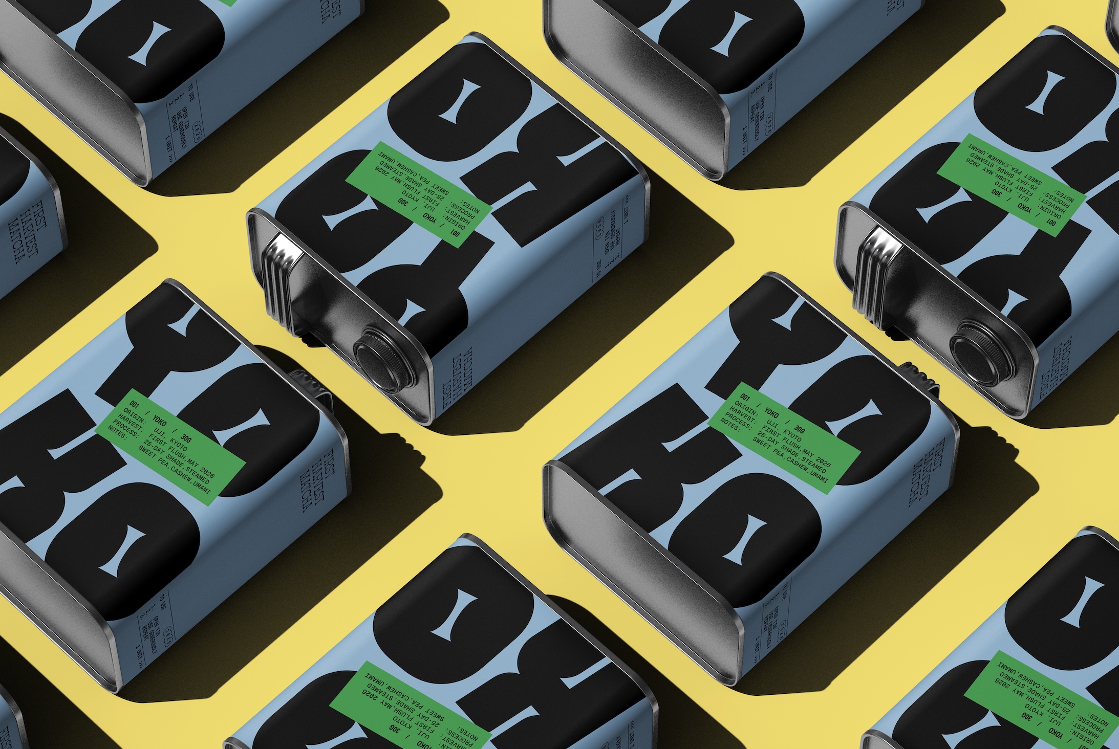
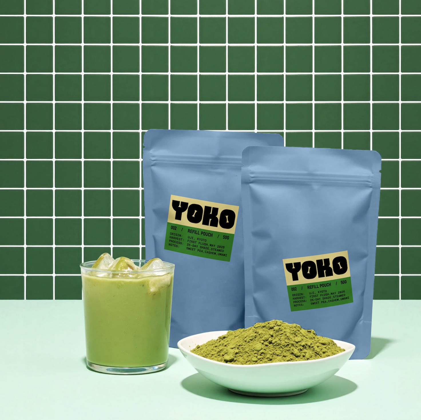
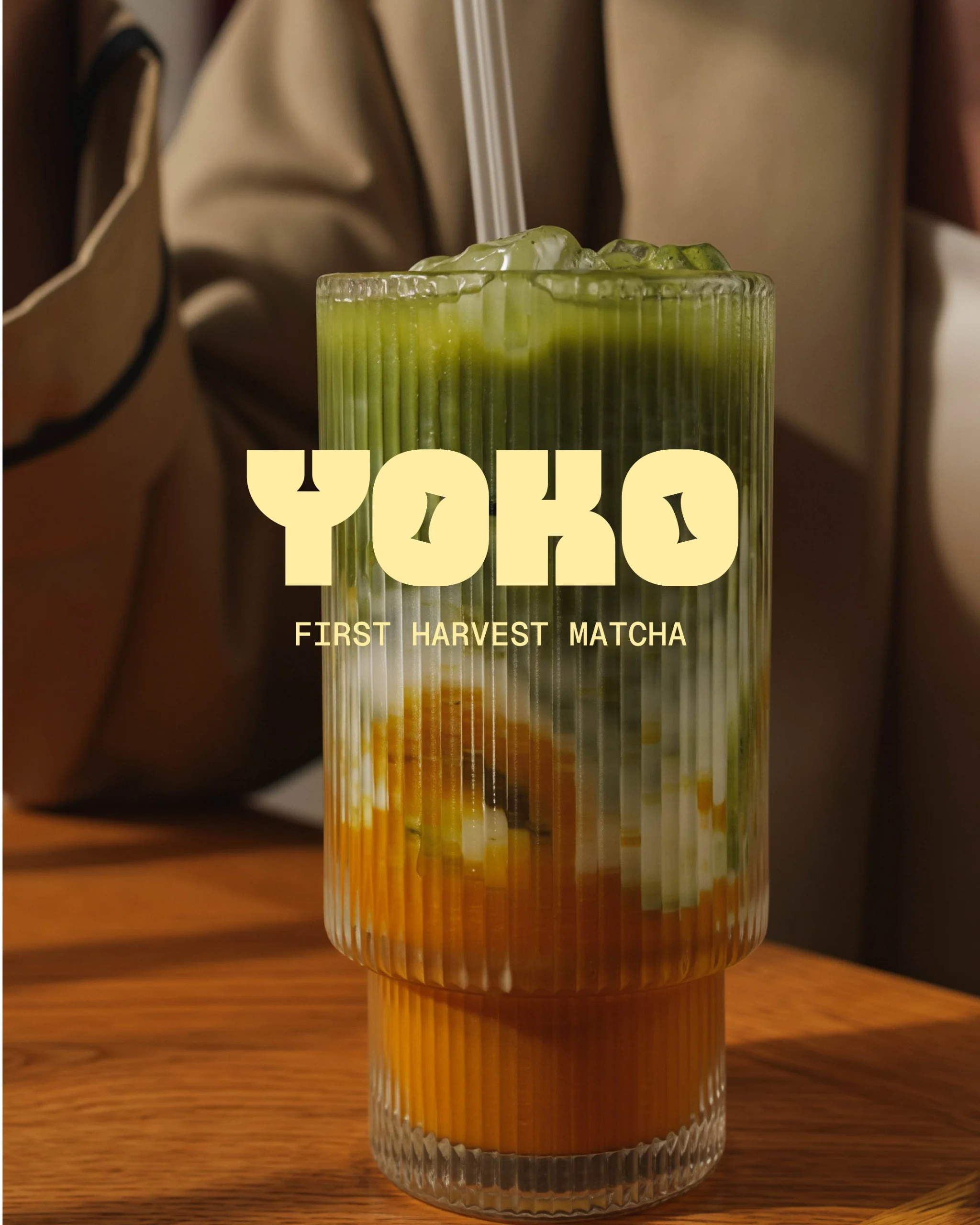
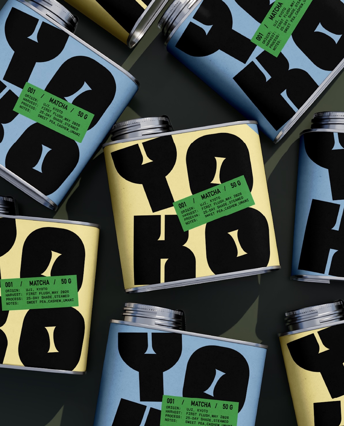
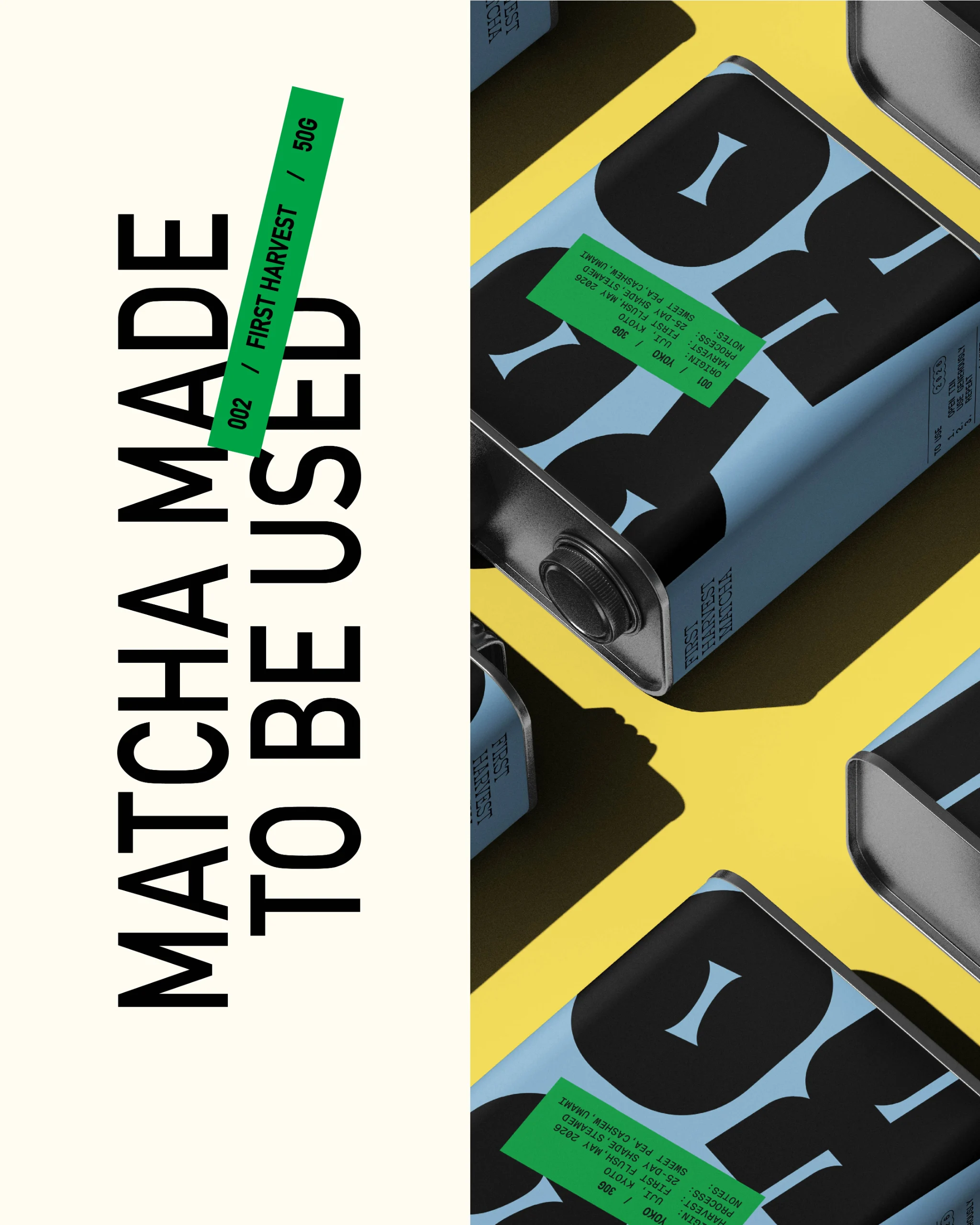
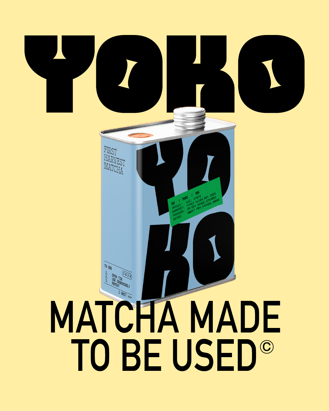
Matcha brands tends to live in a really soft, pastel world. Calming hues, wellness culture, and of course, lots of green. For YOKO, I wanted to move away from those familiar cues and create something bolder and less precious. I kept the green, but it became an accent rather than the entire identity. I paired it with oversized typography, unexpected color and packaging inspired by everyday pantry staples. To make sure quality was still at the forefront, I used a detailed sourcing label for everything. Still premium without taking itself too seriously! And of course, meant to be enjoyed often and used generously
- Studio
- Good Spark Creative Design
- Website / Instagram Account
- Discipline
- Packaging DesignBrand Identity
- Category
- Food & Beverage
- Year
- 2026