St.Oli Collective
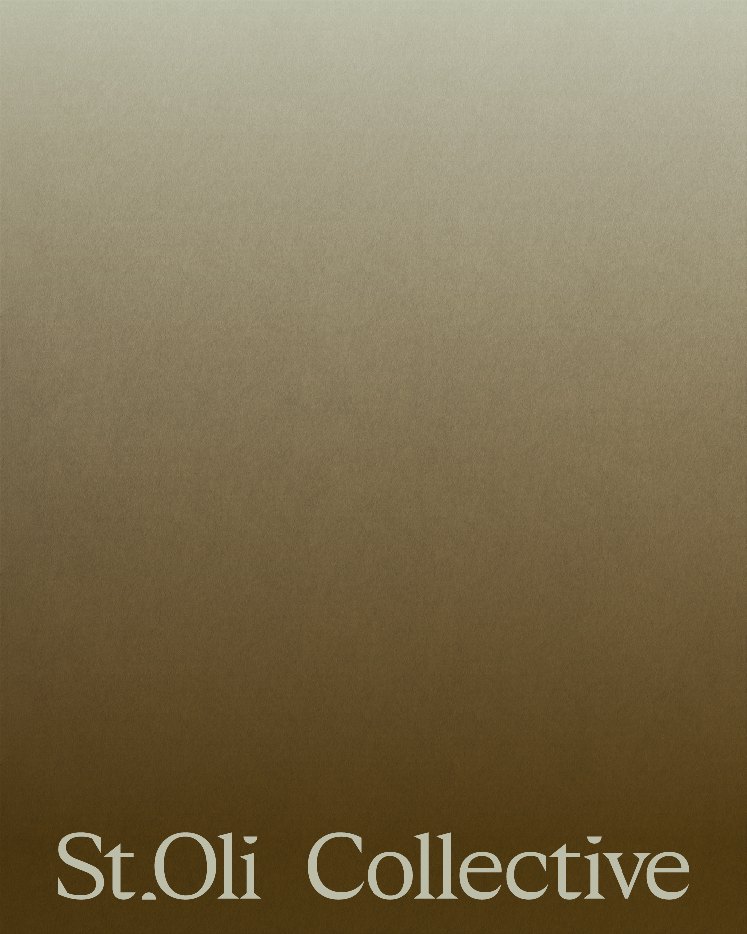
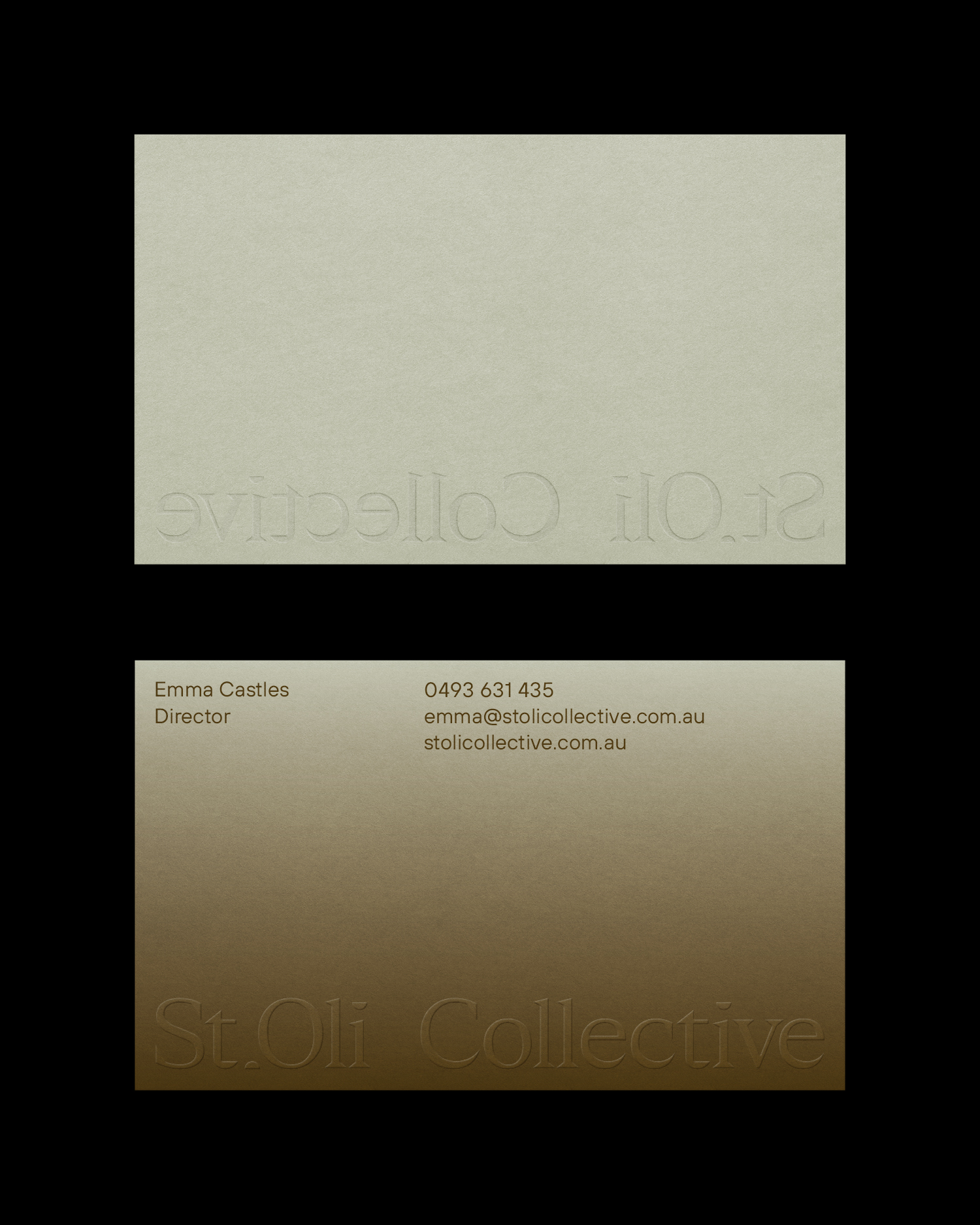

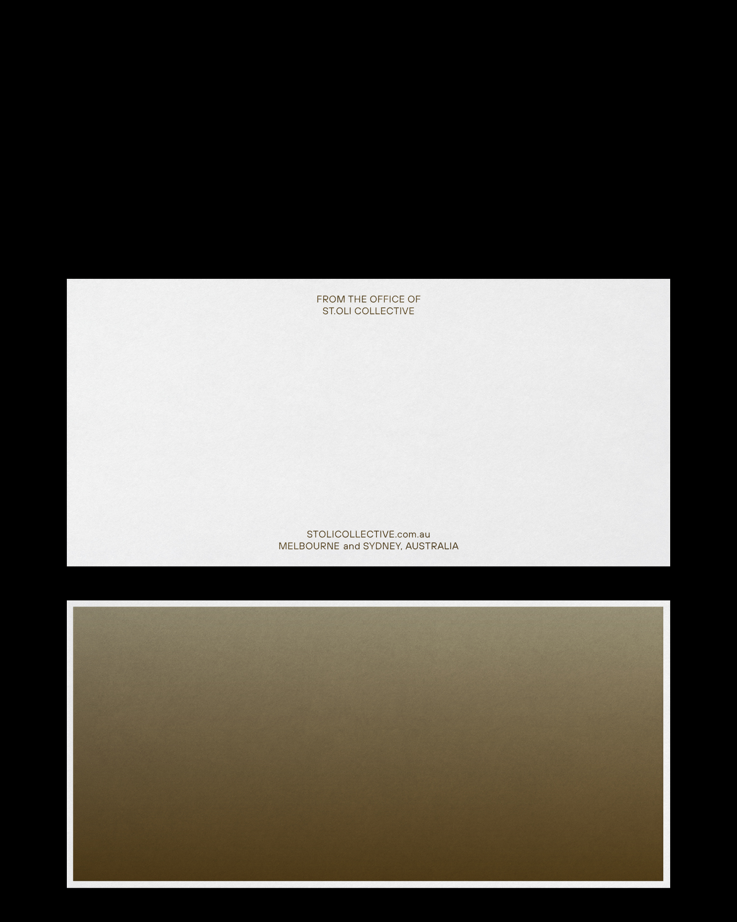
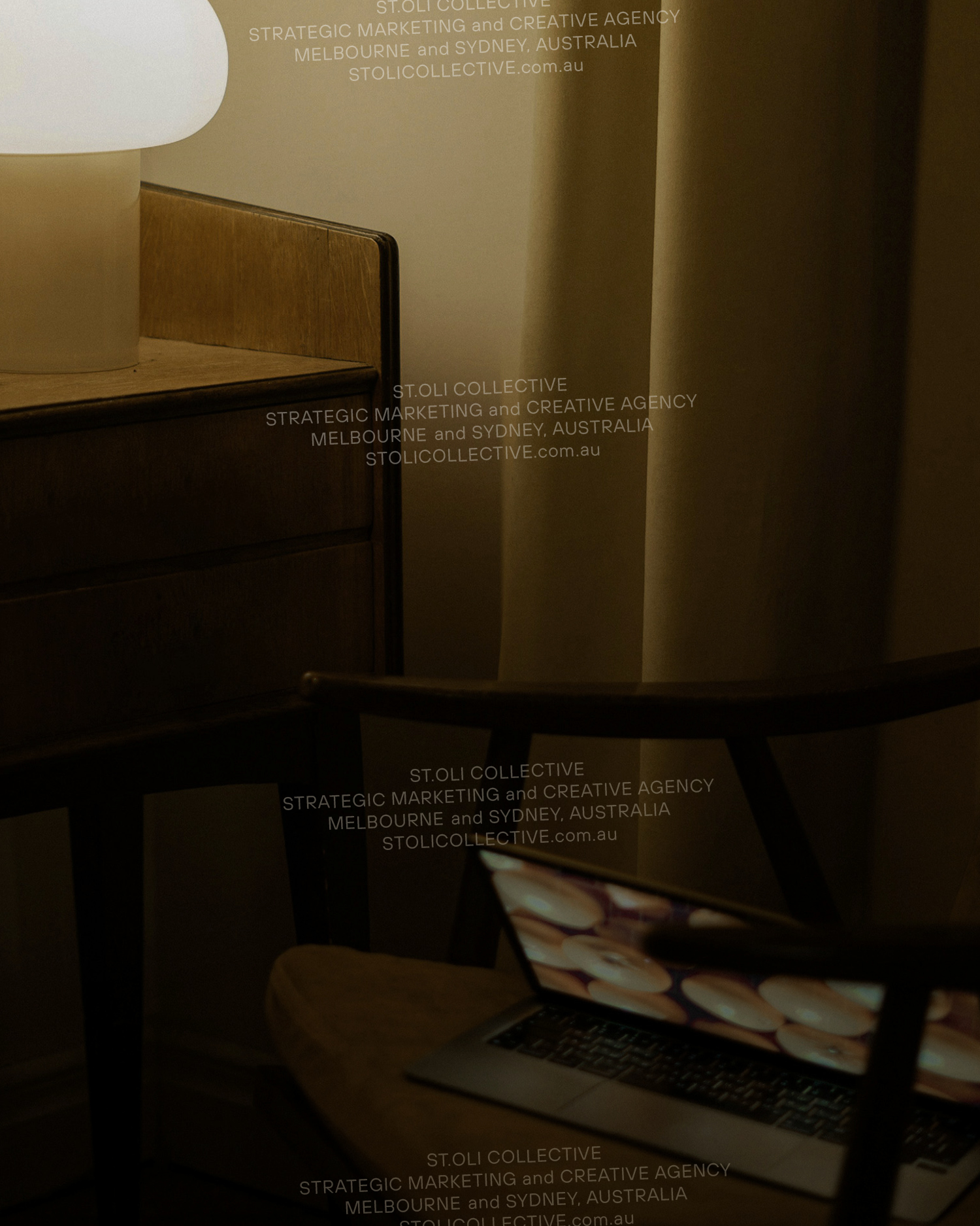
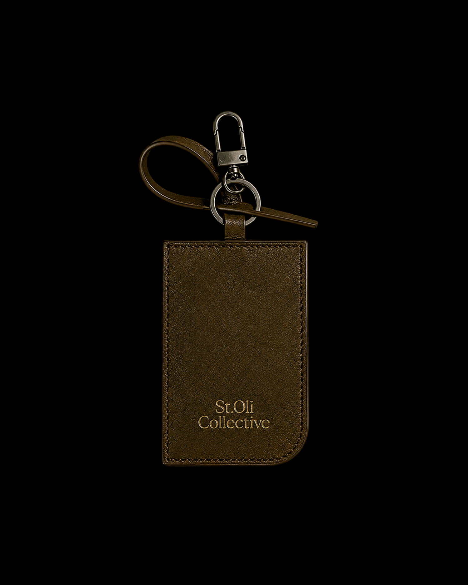
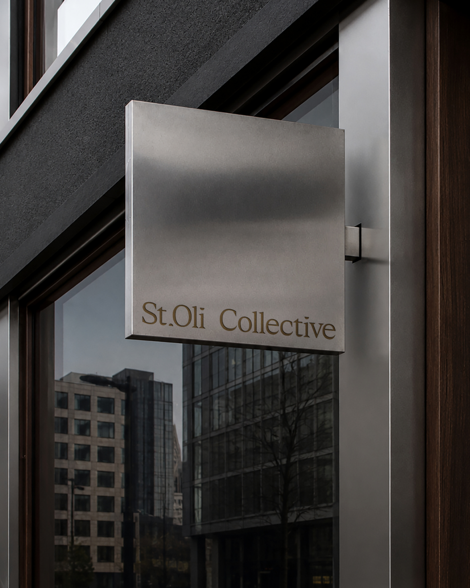
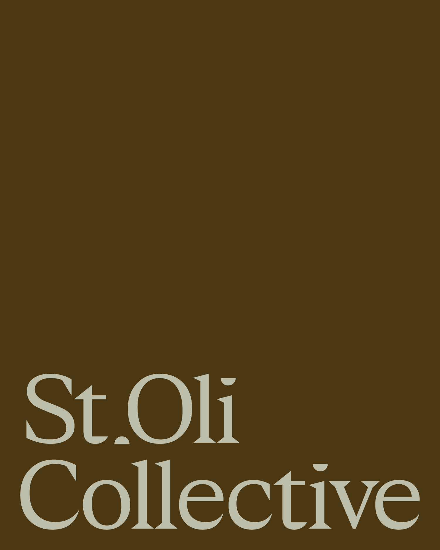
Identity development for St.Oli Collective – an agency built around connection rather than convention. Inspired by the founder’s daughters, Stella and Olive, the identity begins with deeply personal origins before utilising a visual language defined by balance. The wordmark pairs classic typography with contemporary sensibility, where quiet letterforms are offset by pronounced serifs. Reflecting the agency’s modular approach, the logo can be stacked, shortened, or separated while retaining a recognisable core. The principle of reduction continues through the monogram. The “.O” abstracts an olive with its pip removed – a gesture symbolic of the strategy of removing unnecessary process and complexity, leaving only what is of value. The palette finds common ground between the warmth of a gold star and the earthiness of olive green. Use of an even gradient expresses the continuity of ideas and collaboration between agency and its wider collective.
- Studio
- RTOND
- Website
- Website
- Category
- Media & Publishing
- Year
- 2026