el pan de juan
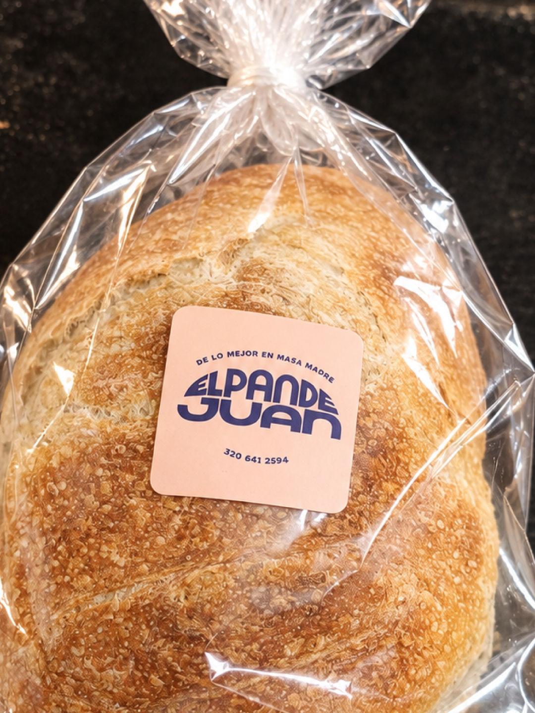
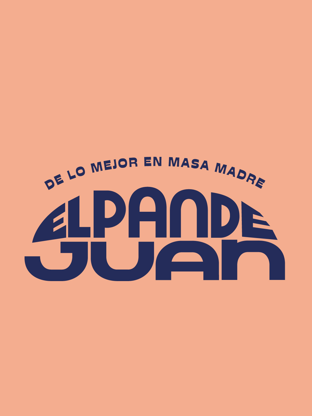
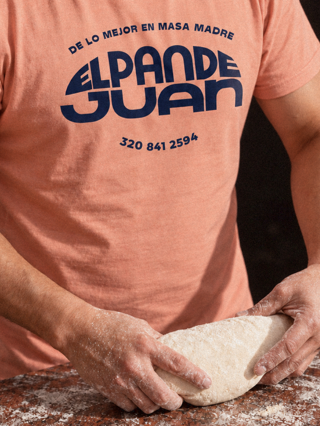
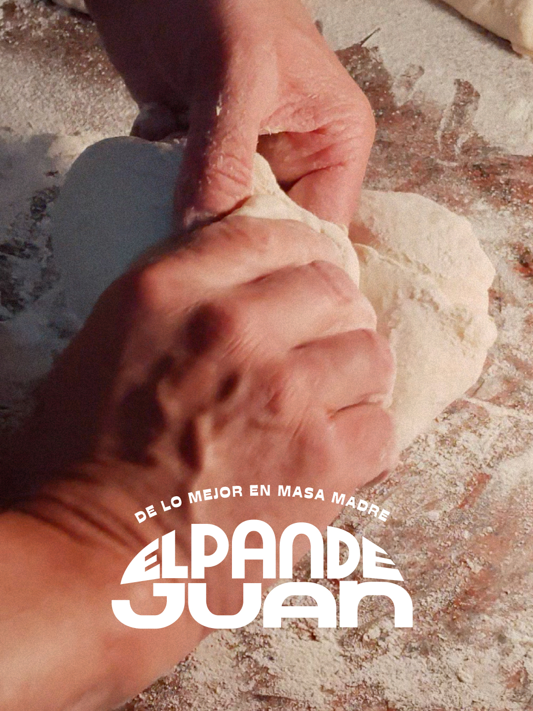
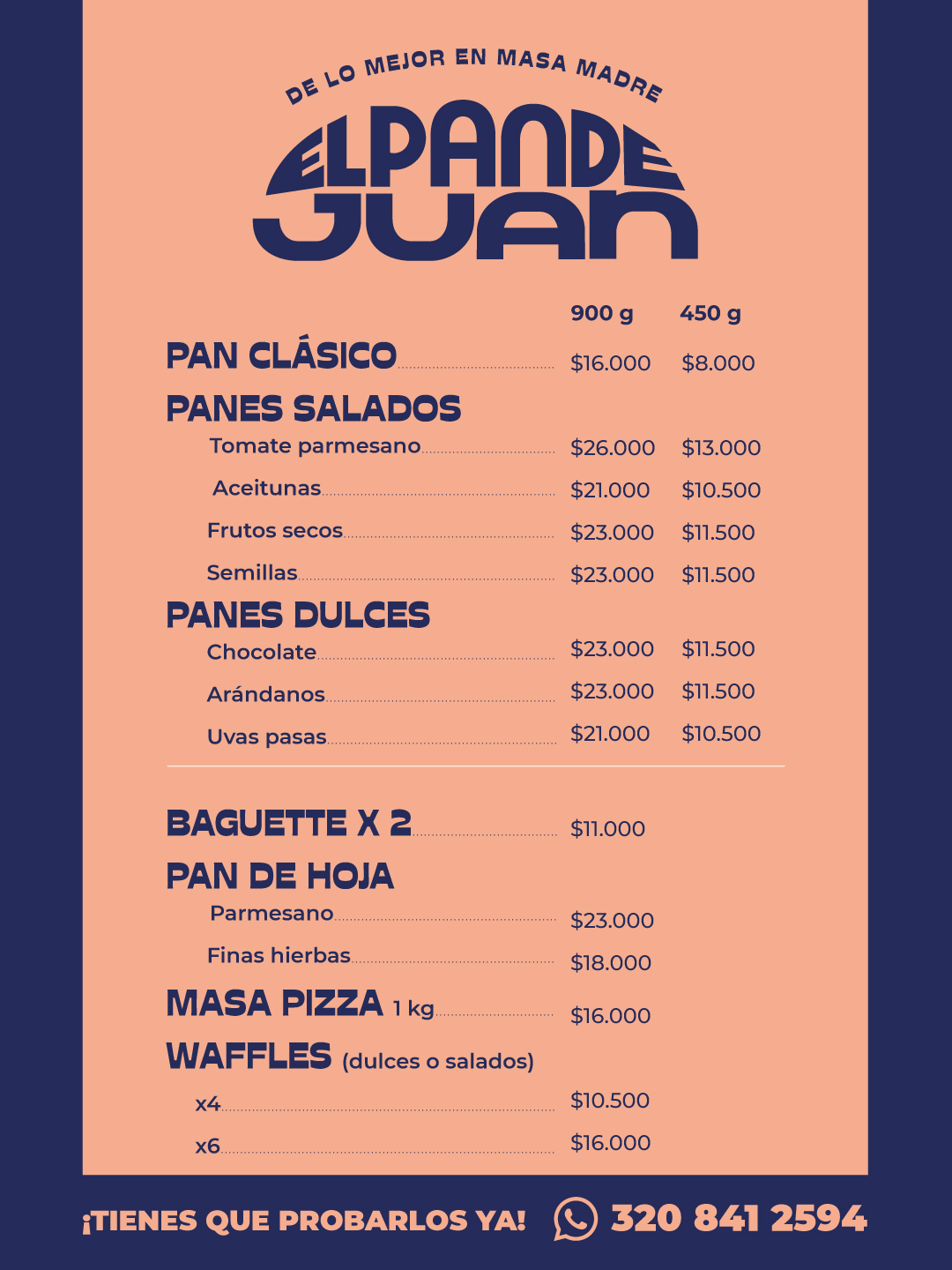
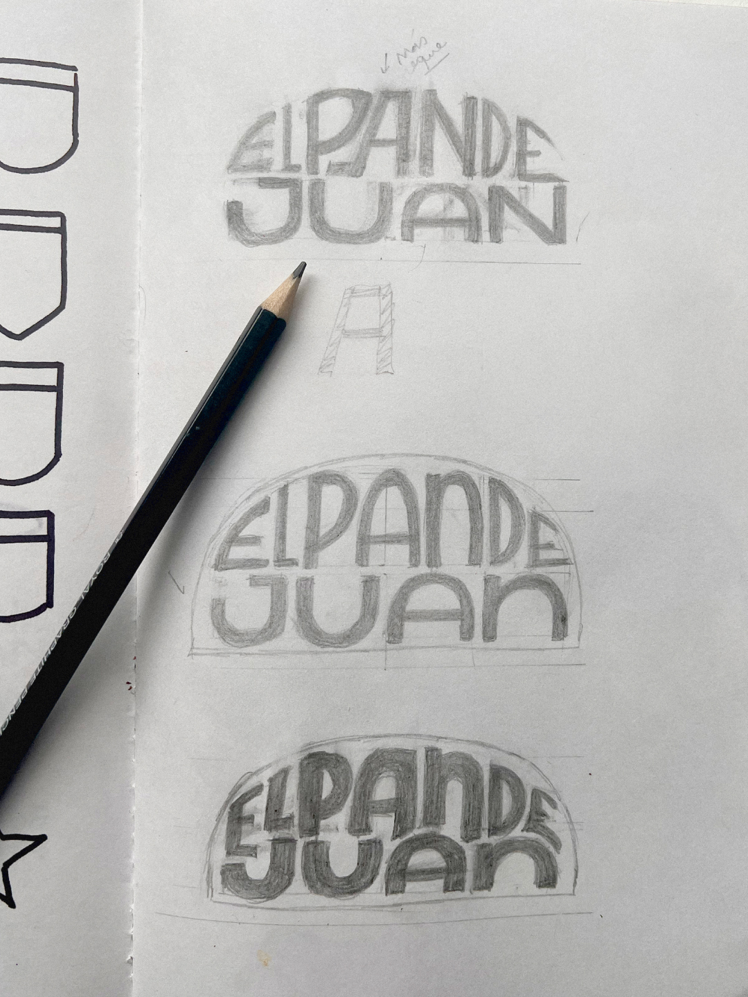
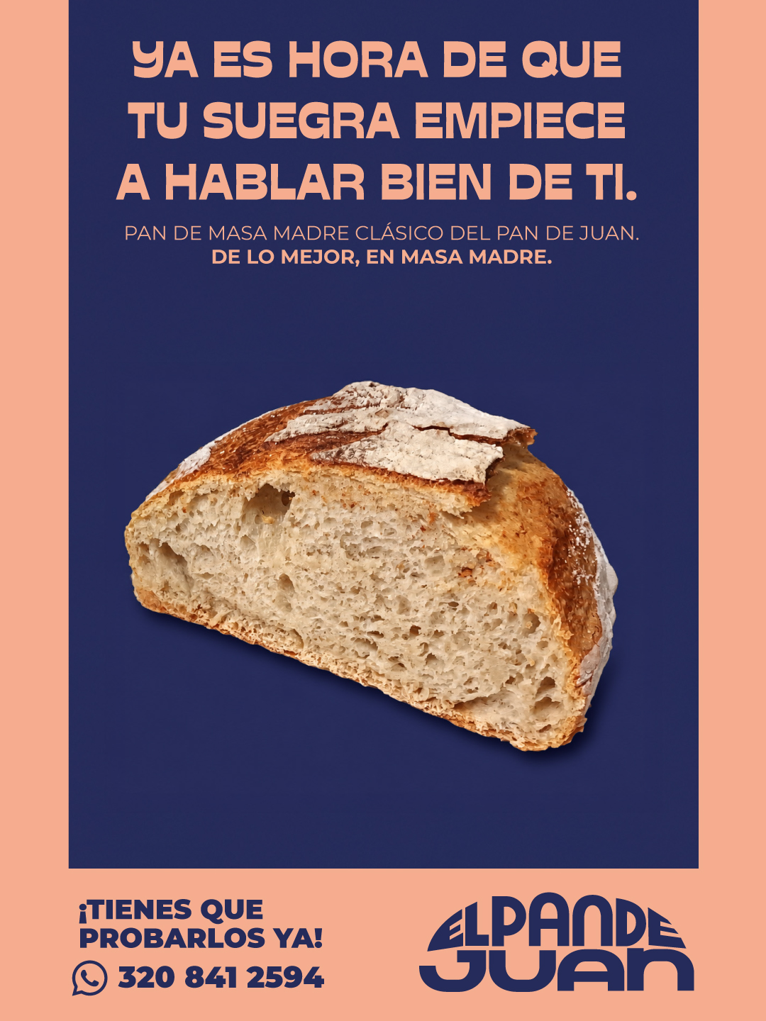
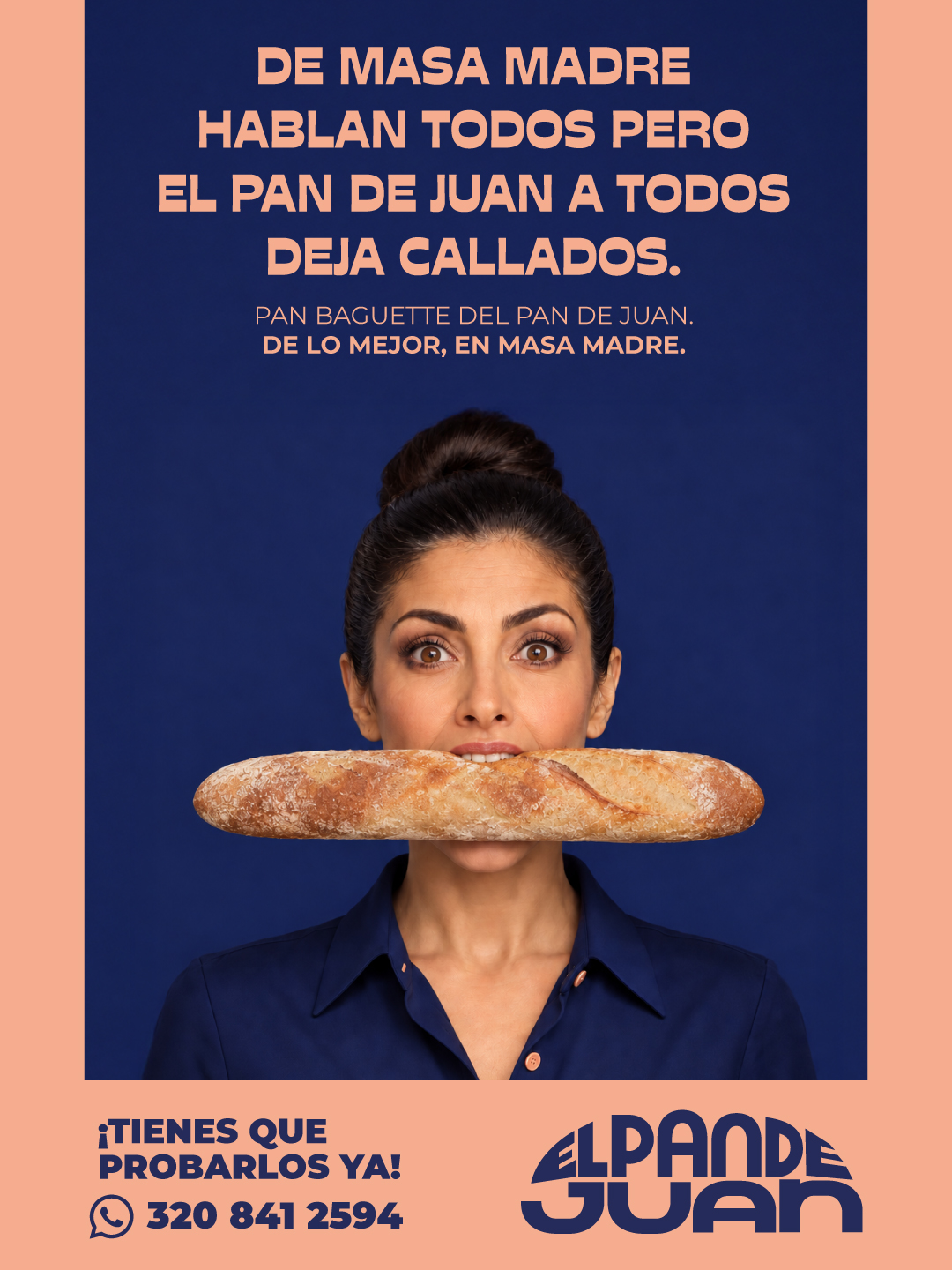
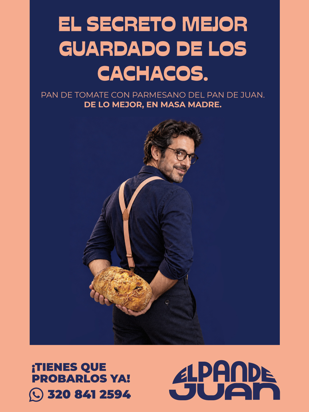
New identity for @el_pan_dejuan. Together with Mario Prieto, we wanted to bring a playful, unexpected face to a category that tends to take design pretty seriously. We brought back an old graphic tradition: shaping letters like the product itself. And chose salmon pink and blue to venture beyond the usual shades of dough and bread. Because a brand can look like bread without looking like every other bakery. The idea is for you to recognize Juan.
- Studio
- arutza
- Website / Instagram Account
- Website
- Discipline
- Brand Identity
- Category
- Food & Beverage
- Year
- 2026